Visualization
The advangages of tidy data are datasets that are accessible to various visualization tools.
Francesca Giannetti
Francesca Giannetti, Digital Humanities Librarian
For the students of “Getting it Done: Managing Information for Better Performance.”
October 1, 2019
Slides at http://bit.ly/AgainstCleaning
About the symbolic meanings of the phrase “data cleaning” and the authors’ efforts to decode those meanings with their work on the NYPL project “What’s on the Menu?” (http://menus.nypl.org/) “Clean” or “tidy” data imposes an order that belies a series of choices about what is worth knowing (and what isn’t). The authors suggest that the efficiency of big systems cannot be the only goal; it must be joined with methods of acknowledging and describing the origin and construction of data in its diversity.
Rawson, Katie, and Trevor Muñoz. 2016. “Against Cleaning.” Curating Menus (blog). July 6, 2016. http://www.curatingmenus.org/articles/against-cleaning/.
No specialized discourse yet exists in the humanities for articulating the gray area and collection of practices that inhabit the space in between “clean” and “dirty” data.
We realized the data points we were making were not “corrections” “cleaning up” the original data set, but their rather formed an additional contribution of information with its own data model.
In other words, the authors realized that 1) they had a data model, 2) it did not align well with the menus data, 3) they needed a new data model that made some compromises relating to scale and diversity.
Tsing writes, “The definition of nonscalability is in the negative: scalability is a distinctive design feature; nonscalability refers to everything that is without that feature … Nonscalability theory is an analytic apparatus that helps us notice nonscalable phenomena.” While scalable design creates only one relationship between elements of a system (what Tsing calls “precision nesting”), nonscalable phenomena are enmeshed in multiple relationships, outside or in tension with the nesting frame. “Scales jostle and contest each other. Because relationships are encounters across difference, they have a quality of indeterminacy. Relationships are transformative, and one is not sure of the outcome. Thus diversity-in-the-making is always part of the mix.”
Tsing reminds us, “At best, scalable projects are articulations between scalable and nonscalable elements, in which nonscalable effects can be hidden.”
Scalable in “What’s on the Menu?” ☞ formatting, typographical conventions, ellipses
Nonscalable ☞ cover images, quotations, handwriting, languages other than English, paper quality, unusual typefaces, damage
As the quote from Paul Beaudoin of the NYPL Labs implies, the advantages of working at scale are usually offset by some loss. Scaling up requires a process whereby the underlying data are simplified (some of the diversity gets smoothed away). Ideally the gains outweigh the losses, but it helps the legibility of the project to document those tradeoffs.
Rawson and Muñoz point to the “dish” as an example of “scales [that] jostle and contest.” As far as the database is concerned, the “dish” is a character string stored in a field. For human readers, it’s “an arrangement of foods and culinary practices in a particular historical moment.” For the index (the method that project staff eventually arrived at to allow scalable searching), it’s a standardized way (“labels”) of pointing to a whole bunch of instances or variants.
The authors briefly describe authority files, something that library catalogers create and share so that we have authoritative ways of referring to people, places, and subjects (and consequently scalable information retrieval). “Authority work” raises the question of “authority” more generally. Which perspectives or cultural logics prevail? Can and should information systems demonstrate more than one?
Our aim is to develop ways of working that validate local experiences of data without removing them from a more global network of information exchange.
The authors conclude with some questions for the reader:
With those communities in mind and even in dialogue, we would ask, what are the concepts that structure this data? And how can this data, structured in this way, point to other people’s data? This way of thinking allows us to see the messiness of data not as a block to scalability but as a vital feature of the world which our data represents and from which it emerges.
Let’s have a look at the What’s on the Menu? (http://menus.nypl.org/) project and examine the ways in which this project embodies (or doesn’t) the ideas explored by Rawson and Muñoz.
In tidy data, according to Hadley Wickham’s definition,
Wickham, Hadley. 2014. “Tidy Data.” Journal of Statistical Software 59 (10): 1–23. http://dx.doi.org/10.18637/jss.v059.i10.
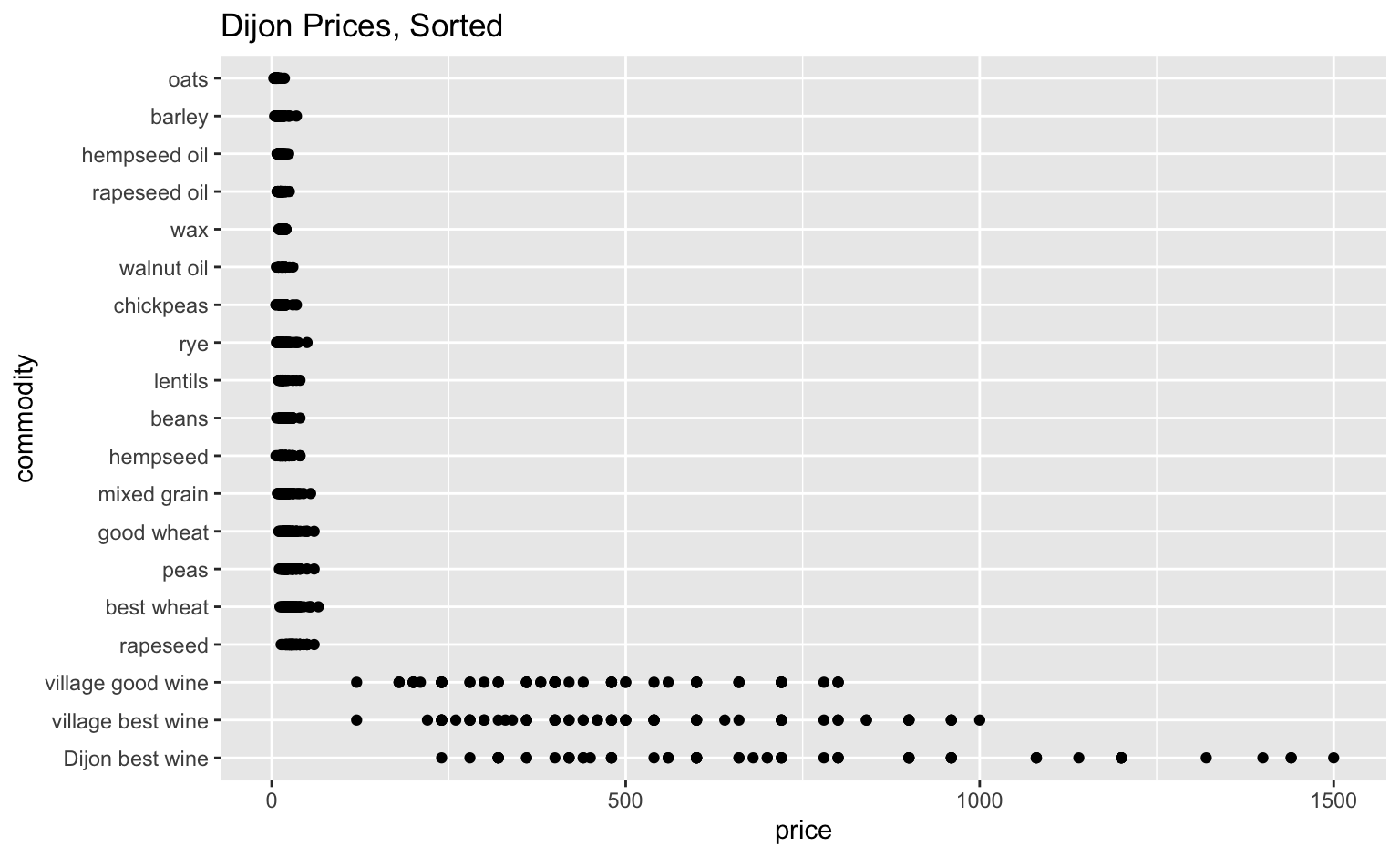
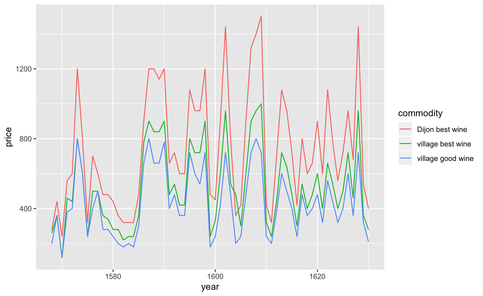
| commodity | measure | 1568 | 1569 | 1570 | 1571 | 1572 | 1573 | 1574 | 1575 |
|---|---|---|---|---|---|---|---|---|---|
| best wheat | quarteranche | 11.67 | 13.33 | 25.00 | 25.0 | 30.00 | 36.67 | 30.00 | 15.00 |
| good wheat | quarteranche | 10.00 | 10.83 | 22.00 | 20.0 | 27.08 | 30.00 | 25.00 | 12.50 |
| mixed grain | quarteranche | 8.33 | 8.33 | 18.33 | 18.0 | 25.00 | 25.00 | 20.00 | 10.00 |
| rye | quarteranche | 6.67 | NA | 14.33 | 14.0 | 22.50 | 21.67 | 16.67 | 8.33 |
| barley | boisseau | 4.17 | 6.67 | 10.00 | 9.5 | 16.67 | 16.67 | 11.67 | 8.50 |
| oats | boisseau | 3.00 | 4.17 | 5.00 | 5.0 | 8.33 | 7.50 | 5.00 | 5.00 |
| hempseed | boisseau | 6.00 | NA | 16.67 | 15.0 | 11.67 | NA | 16.67 | 18.33 |
| peas | boisseau | 11.67 | 13.33 | 18.33 | 17.0 | 27.67 | 30.00 | 25.00 | 14.19 |
| commodity | measure | year | price |
|---|---|---|---|
| best wheat | quarteranche | 1568 | 11.67 |
| good wheat | quarteranche | 1568 | 10.00 |
| mixed grain | quarteranche | 1568 | 8.33 |
| rye | quarteranche | 1568 | 6.67 |
| barley | boisseau | 1568 | 4.17 |
| oats | boisseau | 1568 | 3.00 |
| hempseed | boisseau | 1568 | 6.00 |
| peas | boisseau | 1568 | 11.67 |
The advangages of tidy data are datasets that are accessible to various visualization tools.
These operations can be performed in many spreadsheet or data processing tools, such as Excel, Google Sheets, OpenRefine, as well as various object-oriented programming languages.
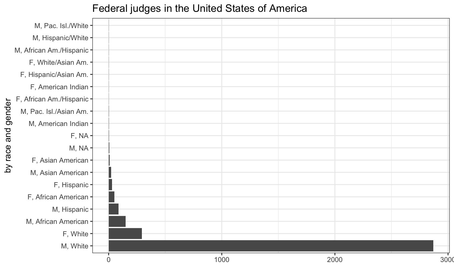
With a partner, go to https://www.fjc.gov/history/judges/biographical-directory-article-iii-federal-judges-export. Download the “Export organized by category” dataset and open it. Have a look at the column headers (variables) in each table, the rows (observations), as well as the type of organizational unit of the various tables (see tabs across the bottom).
Go to Stanford’s Palladio app at http://hdlab.stanford.edu/palladio/. Open the slightly modified data from the “Foodie NJ” survey, and download it to your laptop as a CSV file (File > Download > Comma-separated values). Then drag and drop the CSV file from your laptop to Palladio’s upload window. Then, we’ll expermiment with Palladio’s various visualization options. We’ll start with the Table view, and then progress to Map and Graph.
Take a moment to (re)acquaint yourselves with the variables (columns) and observations (rows) in our dataset. Following Rawson and Muñoz’s lead, let’s ask: “What are the concepts that structure this data?” What assumptions does it make? What is left out? Can you imagine different, more interesting (to you) ways of structuring this data?